Button (Component)
Jump to navigation
Jump to search
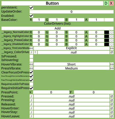
Button component as seen in the Scene Inspector
This article or section is a Stub. You can help the Neos Wiki by expanding it.

Intoduction
A Button allows for users to click on its slot. It provides visual feedback by altering the colors of graphics on the slot, and is needed for several other components, such as Text Field, to function.
Usage
| Fields | ||
|---|---|---|
| Name | Type | Description |
persistent
|
Bool | Determines whether or not this item will be saved to the server. |
UpdateOrder
|
Int | Controls the order in which this component is updated |
Enabled
|
Bool | Controls whether or not this component is enabled |
BaseColor
|
Color | The color that all other tints will be based on |
ColorDrivers
|
ColorDriver | A list of sets of colors. Each one points at another component's color, and determines how it looks normally, when highlighted, when pressed, and when disabled |
__legacy_NormalColor
|
Color | Internal |
__legacy_HighlightColor
|
Color | Internal |
__legacy_PressColor
|
Color | Internal |
__legacy_DisabledColor
|
Color | Internal |
__legacy_TintColorMode
|
ColorMode | Internal |
__legacy_ColorDrive
|
Color | Internal |
IsPressed
|
Bool | True if the button is being pressed |
IsHovering
|
Bool | True if someone is hovering over the button |
HoverVibrate
|
VibratePreset | How a controller should vibrate when hovering over this button |
PressVibrate
|
VibratePreset | How a controller should vibrate when pressing this button |
ClearFocusOnPress
|
Bool | Makes the button stop being hovered when a press occurs |
PassThroughHorizontalMovement
|
Bool | FIXME |
PassThroughVerticalMovement
|
Bool | FIXME |
RequireLockInToPress
|
Bool | FIXME |
RequireInitialPress
|
Bool | FIXME |
PressPoint
|
Float2 | FIXME |
Pressed
|
ButtonEventHandler | Internal |
Pressing
|
ButtonEventHandler | Internal |
Released
|
ButtonEventHandler | Internal |
HoverEnter
|
ButtonEventHandler | Internal |
HoverStay
|
ButtonEventHandler | Internal |
HoverLeave
|
ButtonEventHandler | Internal |